

Click to learn more
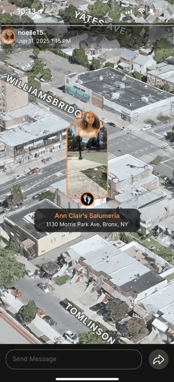
Ubiq is a spatial media platform where there is no feed; instead, there is an interactive 3D map where you can see what you, your friends, classmates, and strangers have visited through posts.
My team was tasked with improving the UX/UI design for Ubiq's profile page.
Team: Ruba Akbar, Soja Sunny, and Yi Li
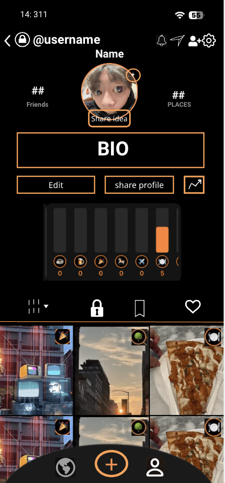
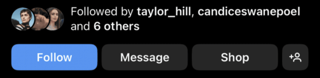
The original personal and other profile pages had a lot of bugs, which confused users and kept them from enjoying the Ubiq experience. So we want to add features similar to those on other social media platforms, such as Instagram and TikTok, that users already know, so they can navigate the platform more easily. The profile page lacked customization.
During this time, Ubiq was still in its development stage, and they are primarily targeting students in high school and college.


With these new designs, users will have a better experience navigating the platforms.
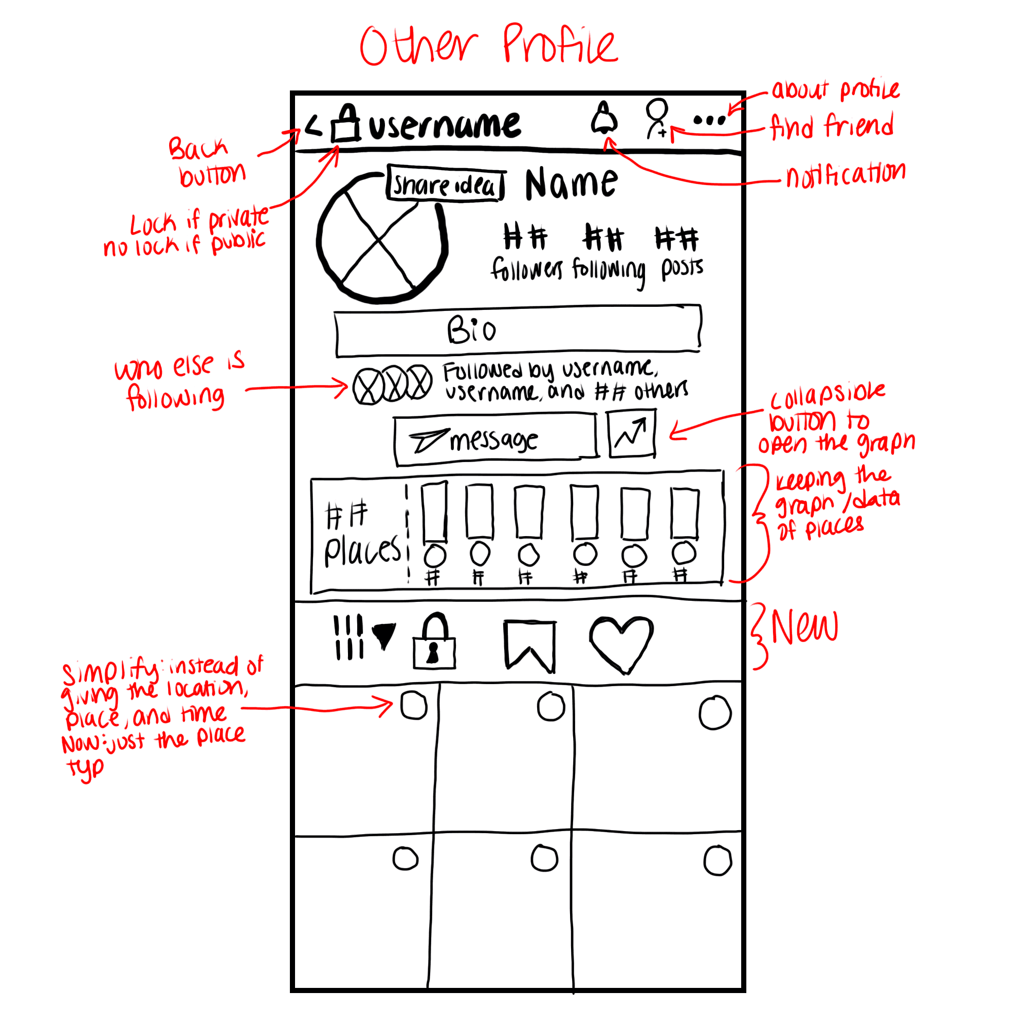
Previous complaints were that users didn't know how to go back, so they got stuck, which made them frustrated, resulting in them leaving the app. So now there will be a physical back button on pages in the top left of the screen.
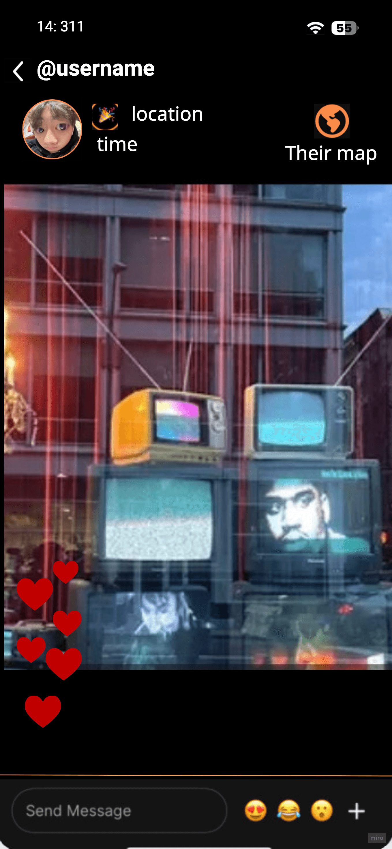
Quick access emoji when viewing others' posts
Previous complaints that the graph table of places been were in the way when viewing the profile page will no longer be an issue because it will now be collapsible and can be hidden from view.
But also new, exciting features that will make Ubiq feel more unique, such as
"My Map" feature where users can see their own posts on the 3D interactive Map
"Their Map" feature where users can find, when viewing others' posts, where they can see only one selected user's post on the 3D interactive Map.








Case
Studies


1
2



Ubiq is a spatial media platform where viewers can see their posts on a 3D interactive map.
Ubiq also have a filter option to sort through what users want and don't want to see on their 3D map.
Ubiq also added new features to differentiate whether other users to you are your close friends or a classmate at your school.
What Ubiq has design so far
Grad cap icon on top of a user profile symbolizes you go to the same school as another user
Crown icon on top of a user profile symbolizes your friends.
Ubiq users were having difficulty understanding the purpose of hats and crowns. The issue is comprehension, not the layout. Additionally, users didn't know where the filters were.



Old UI
Updated story viewing of a friend
Updated story viewing of a student
Changes don't have to be big to make the greatest impact to the user experience
Top left: didn't include a information such as if another user is a friend or student
Orange text to match Ubiq colors.
Top left: added the text "[Name of College] Student" under the user's name


